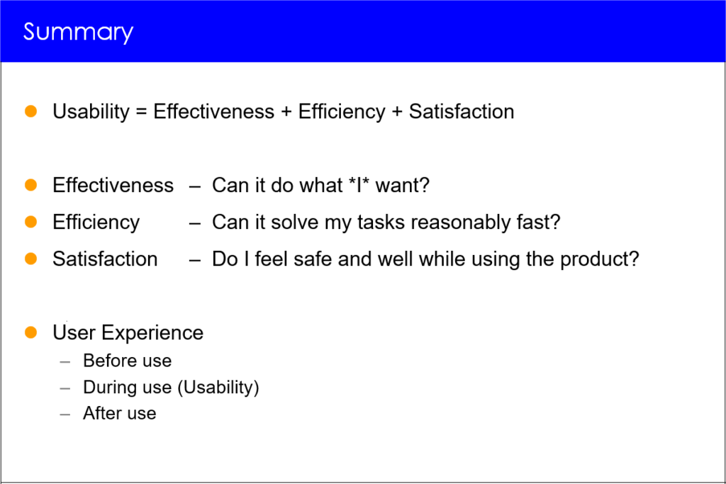
Usability professionals should pay attention to the usability of their deliverables and services to stakeholders.
End users are important, but stakeholders are the UX professional’s primary users.
Overview
- The challenge
- Conferences
- Presentations
- Usability test reports
- HiPPOS
- A simple solution: Speak Up!
- The paper that was never published
The challenge
Having been a usability professional for almost 35 years, I am concerned that many usability professionals’ deliverables are hard to use or don’t meet their users’ needs.
Project teams and other users of usability products such as field reports, personas, and usability test reports have a legitimate claim for usable products.
Good usability professionals should follow the principles that they preach to others, including knowing users, designing with users, evaluating their products with users, and using the knowledge gained from evaluation and other user feedback to improve their products.
We often complain that developers don’t listen to us.
Enough complaining!
Let’s make our advice more usable and useful to them!
— Jeff Johnson
Conferences
You might expect usability conferences to set a gold standard for usability. Unfortunately, this is not always the case.
At several recent usability conferences I have used some of the breaks to informally interview a number of participating usability professionals about their likes and dislikes regarding the usability of the conference. To my surprise, I found that the very idea of considering the usability of a conference was new and interesting to them. Unfortunately, conference organizers have shown little interest in these informal studies of user needs and usability issues.
Here are some of the things I learned:
- Names on badges must appear in large print so they can be read from a distance. Also, badges must either be printed on both sides or designed so they can’t turn their blank side towards other participants.
- Most usability conferences hand out session evaluation forms. However, it was not clear to participants what practical impact the forms had. Also, the forms were not always available on the conference’s app.
- Networking and exchange of knowledge is an important part of conferences. Not all conferences support these user-centered activities, for example by providing free buffet lunches.
- As to the presentations, speakers often forgot to repeat the questions from the audience, so the discussions were mainly for the people in the first 2-3 rows – and the session chairs did not intervene.
- Spontaneously scheduled sessions were highly valued. Lightning sessions were also highly valued because they were compact, and “you know that in the worst case you will only suffer for 5 minutes”.
- At a recent usability conference, a keynote speaker who was supposed to speak for 60 minutes talked for more than 90 minutes without being stopped by the conference chairperson.
- Some presentations were poor, boring or hard to understand.
Why is it then that we are putting so much attention on ensuring the quality of the papers and so little attention on ensuring the quality of the talks?” … The quality of presentations should be considered in making program decisions.
— Moshe Y. Vardi
Presentations
Many presentations by usability professionals at conferences and for stakeholders have interesting and valuable content, but they are often overloaded with breathtaking graphics. Slides with little text can be hard to understand a month later. At a recent conference, the slides had pictures of birds – when I pulled down the slides later, I couldn’t recall key points because of the lack of text. Text and breathtaking graphics should be mixed appropriately to make the points understandable after the talk.
Some presenters exceed the agreed time limit for their presentation – and still expect to have time for “just one question.”
Almost all presentations end with a “thank you” slide with the name of the presenter displayed prominently with a beautiful picture, for example a sunset, in the background instead of a more usable (and graphically dull) “Takeaways” summary.
(an introduction to usability)
Usability Test Reports
Qualitative usability testing is the most widely used usability method. Results from a usability test are often communicated through a usability test report.
Unfortunately, some of these reports suffer from usability problems. Since 1998, I have collected usability test reports from more than 120 professional colleagues who independently tested the same websites; afterwards they discussed their results and the reasons for any differences in a subsequent workshop.
Some of these usability test reports are published – anonymously, of course [2]. From these reports we learned the following about the usability of usability test reports:
- A usable usability test report should start with a succinct executive summary of at most one page.
- It should be short – no more than 30 pages regardless of how much the client paid for the usability study (of course there is no page limit to appendices).
- Usable reports should clearly distinguish between disasters and minor problems.
- In addition to usability problems, they should include the most important things that users liked about the product so the development team won’t accidentally remove or change these positive features.
I recently reviewed a usability test report for a client, who had commissioned a professional usability evaluation company to do a large scale usability test involving about 100 users. The usability test report had 600 pages but no summary and no table of contents. The report mainly consisted of endless lists of usability problems. Some of the reported serious problems could not be traced back to the video recordings of test participants’ interactions with the system. Several of the videos were unusable due to bad sound quality. Even after the company was informed that the sound quality was bad, they continued producing videos with incomprehensible sound.
Conveying usability test results convincingly to clients is key to a successful usability test. Nevertheless some usability professionals use one-way presentations to communicate usability findings. A more user-centered way is to communicate findings in workshops, which encourage two-way discussions and a deep understanding of issues.
HiPPOs

A HiPPO is an unsubstantiated statement like “I want a carousel on the home page” brought forward by a high-ranking manager. HiPPO means “Highest Paid Person’s Opinion”. HiPPOs are particularly damaging if they are put forward by a usability manager.
Free-roaming HiPPOs can cause havoc because they signal that the organization accepts opinions instead of usability research. They violate the foundations of modern, research based usability work.
HiPPOs brought forward by rationally thinking persons can be tamed by gently insisting that they are hypotheses that should be confirmed or disproved through usability tests using realistic data sets.
A simple solution: Speak Up!
Usability professionals need to do better – and you can help, regardless of whether you are a software professional or a usability professional.
Usability is essential and has come to stay. The days of “If it was hard to code, it must be hard to use” and “Users should do what they are told to do without whining” are gone – but sometimes you may need to remind your usability professionals of this.
Whenever you encounter deliverables from usability professionals that are hard to use, tell them openly, provide clear examples of poor usability, and remind them that they are ethically obliged to pay attention to their users.
My message to usability professionals is:
Do as you preach and listen humbly to your primary users, the stakeholders.
My message to project managers and their teams is:
Speak up and demand that your usability professionals deliver usable products that meet your needs.
The paper that was never published
I wrote the above text in 2017 and submitted it to the Communications of the ACM. It was politely rejected; the two reviewers provided wildly different reasons for rejecting it.
I revised the paper in accordance with the suggestions from the reviewers and re-submitted it. It was reviewed by two other reviewers, who again politely rejected it. The reasons from all 2+2 reviewers differed considerably.
Here’s the paper that was never published. Perhaps you can help me improve it? 😉